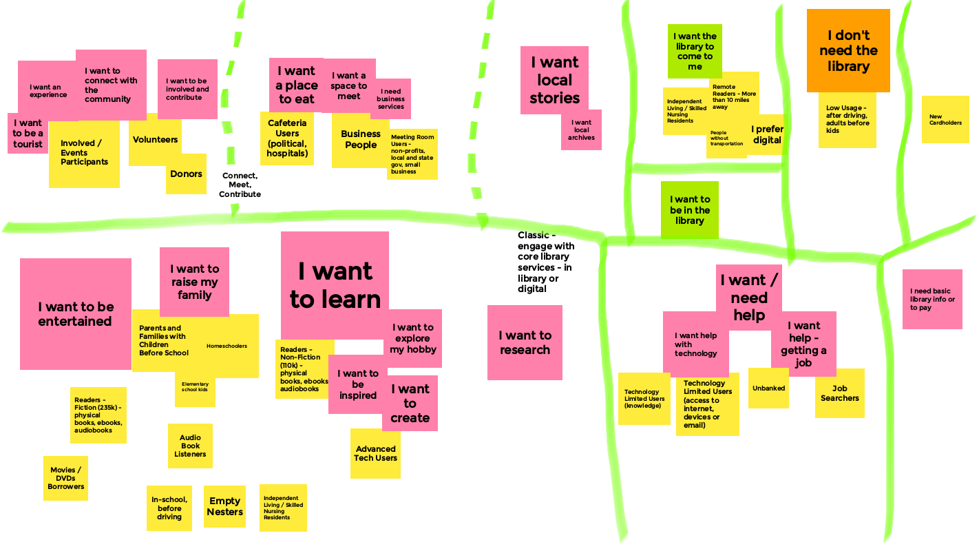
http://www.davidleeking.com/wp-content/themes/thesis_16

From the category archives:

Web Design

Showing Patrons the Door

by David Lee King on February 3, 2010

First, a funny story. When I lived in Nashville, I frequented a cool used record store. During one trip, I was trying to decide whether or not to buy a couple of old jazz cassette tapes (hey – I was on a tight budget).

The tiny shelf these cassette tapes were on was packed WAY too tightly, so when I tried to pull one cassette out to examine it, 2-3 others would fall out at the same time. And make lots of noise as they hit the floor (it was tile, of course). This happened a couple of times … in a row … and was pretty embarrassing!

So – to ease my embarrassment at not being able to figure out how to successfully pull a cassette tape off the shelf, a “helpful” shop security guard came over to me. He stood behind me, stared at me for a second, and said (and I quote) – “you’ve got 10 minutes, then you’d better be out of my store.” Then he walked away.

Boy, that helped. Thanks :-) That day, the store essentially “showed me the door” in no uncertain terms. Even though the problem wasn’t me – it was their tightly-packed shelf.

Now on to the title of this post, and to my point. Showing patrons the door? Yikes – we’d never do that (under normal circumstances, anyway)! Unlike the silly used record shop, librarians would never consciously walk up to a patron and tell them to leave if that patron was having trouble using something in the library … right?

I think we DO sometimes tell our patrons to leave when we make things difficult for them. We might as well be saying “here’s the door, don’t let it hit you on the way out.”

For example, if your library has a blog, do you moderate those comments? Quickly? I know of libraries that can go 1-2 weeks before they get around to moderating comments. In and of itself, moderating a comment is fine, as long as they are moderated fast (like within 1-4 hours). Blog posts are supposed to be the start of a conversation; comments continue that conversation. If those comments aren’t approved at least in the same day, you have essentially killed that conversation. To me, that sounds like showing patrons the door.

Is your website confusing? Do customers have to puzzle out what they need to do next while on your site? If so … your website is showing patrons the door. Same with our catalogs – a confusing catalog might just steer customers away from checking stuff out – and that’s one of our major, must-have services!

Do you let patrons sign up for a library card online (some libraries don’t)? How about having an online sign-up form that asks for WAY too much info? That’s a sure-fire way to show patrons the door.

What labels and naming schemes do you use on your site? Using heavy-duty librarian jargon might just be a great way to usher patrons towards the door.

How about not having a Facebook Page (or even blocking Facebook altogether)? Or simply doubting that your patrons use Facebook (without actually signing up for a Facebook account and checking)? Yet another way to show a group of very active, involved patrons the door.

Other ways to show patrons the door might include hard to find stuff on your website, hidden content, or even library services that aren’t mentioned anywhere on your website.

So – what do you think? What else shows patrons the door, and how can we fix that?

Pic by Cayusa

Share:
  • del.icio.us
  • Twitter
  • Facebook
  • email
  • Digg
  • FriendFeed
  • LinkedIn
  • Google Bookmarks
  • Technorati
  • BlinkList
  • Reddit
  • StumbleUpon
  • Tumblr
  • Netvibes
  • Ping.fm
  • MySpace
  • Print

{ 11 comments }

Designing the Digital Experience Presentation

by David Lee King on January 7, 2010

On Tuesday, I gave a Designing the Digital Experience presentation at Nassau Library System in New York. It was a fun time – lots of good questions and discussion!

So … here are the slides from that talk. Enjoy!

Share:
  • del.icio.us
  • Twitter
  • Facebook
  • email
  • Digg
  • FriendFeed
  • LinkedIn
  • Google Bookmarks
  • Technorati
  • BlinkList
  • Reddit
  • StumbleUpon
  • Tumblr
  • Netvibes
  • Ping.fm
  • MySpace
  • Print

{ 0 comments }

Check Your Signs!

by David Lee King on January 4, 2010

I was room 429 ...A couple months ago, I stayed at a hotel in Wisconsin with this sign … seems pretty useful, huh?

Except if you’re in room 429, like I was. I actually had to hunt a bit to find the room (it wasn’t obvious).

The point? Make sure to check your digital “signage” once in awhile. Make sure your labels and headings still make sense. Did you change the name of a room or a service? Make sure to change that name everywhere on your website, too.

Has your budget shrunk and you needed to drop a few databases? Make sure you removed those links on your database page (and any other page that mentions them, too).

Have you checked the driving directions to your library lately? At a previous job, I checked them out after starting, and discovered they were WRONG. So I actually hopped in my car, and drove around for awhile, taking notes of different ways to get to the library – and updated those directions.

Website maintenance never stops, huh?

Oh – and Happy New Year, too! I am looking forward to a fun, challenging 2010 – how about you?

Share:
  • del.icio.us
  • Twitter
  • Facebook
  • email
  • Digg
  • FriendFeed
  • LinkedIn
  • Google Bookmarks
  • Technorati
  • BlinkList
  • Reddit
  • StumbleUpon
  • Tumblr
  • Netvibes
  • Ping.fm
  • MySpace
  • Print

{ 3 comments }

Inviting Comments

by David Lee King on December 17, 2009

Sometimes, a blog post or article on a library website doesn’t get any comments. And that’s fine – not every post is comment-worthy, right? But there are ways to prompt, or “invite” visitors to comment … even by using the website’s built-in comment functionality. Let me show you what I mean.

Here are two examples – the first from my library’s website, and the second one from Atchison Public Library. Both of these examples are screenshots taken from the main page of both websites – each a teaser for an article.

Mine first (screenshot below):

no prompting

We let the comment functionality simply announce that no one has left a comment on this post (and darn it – it’s MY post!). We do that via the text “0 Comments.” This works fine – it’s what that functionality is supposed to do.

But check this out – here’s what Atchison Public Library does (screenshot below):

prompting for comments

See the difference? Atchison uses their lack of comments to … invite people to comment. They do this by prompting their website visitors to “be the first to comment.”

I know – it’s one of those little detail-y things. But it’s that type of detail, that focus on inviting patrons to participate, that just might prompt them … to participate. It might just convert that lurker into a more active participant.

Nothing wrong with that – good job, Atchison!

Share:
  • del.icio.us
  • Twitter
  • Facebook
  • email
  • Digg
  • FriendFeed
  • LinkedIn
  • Google Bookmarks
  • Technorati
  • BlinkList
  • Reddit
  • StumbleUpon
  • Tumblr
  • Netvibes
  • Ping.fm
  • MySpace
  • Print

{ 1 comment }

Widening your Nets, Decentralizing your Web Services

by David Lee King on December 9, 2009

Last summer while at ALA’s annual conference in the Chicago area, a couple friends and I were eating lunch at the Corner Bakery Cafe and saw this ad on one of the tables.

facebook URL ad

The interesting thing about the ad wasn’t so much the content itself (though I’m sure it’s good stuff). We got all geeked out over the URL associated with the ad. Why? Because they didn’t point to their website.

Instead, they pointed directly to their Facebook Page.

Think about that for a sec, because there are some pretty large implications for library web services. I know that many of us have worked for years to centralize all our websites, tools, and services into one place – preferably at www.mylibrarysnamegoeshere.org …. some of us have worked hard to get federated search tools to work on that library website, and have even integrated some of our library catalog content into our websites, as well.

But people aren’t visiting our websites (well, not in droves, anyway). They are going to other places, like Facebook (and YouTube, and Google, and …). And of course we should be active in some of those social sites. But what about pointing directly to those social sites … in an ad? That’s taking it one step further, isn’t it? Pointing directly AWAY from our website … to some social tool like Facebook?

This could work for libraries. If you have a Facebook Page, check out your Page demographics (Facebook provides some basic stats on Facebook Page visitors). Who’s your main audience in Facebook? Doing anything for that group of patrons already?

If so, you might think of taking it one step further, and pointing them directly to the Facebook Page. Why?

  • This group already uses Facebook
  • Your Facebook Page comes ready-made for interaction – comments, discussions, and likes.
  • it can have an easy-to-remember URL (i.e., ours is facebook.com/topekalibrary)
  • For the customer, it’s a direct connection to the library. Once they “become a fan,” they get all your stuff… reminders, questions,comments, etc.

But even better – for us sneaky librarians, it’s also a direct connection to a segment of our customers. But not just any customers – these customers already use Facebook and actually LIKE to interact. If they have become a fan of your library, that means they like to interact … with the library.

So don’t be shy! Spread out your nets … decentralize those web services. Send out status updates. Ask questions. Start discussions. Get feedback about new services. And in the process, have fun interacting with a group that actually WANTS to interact.

Share:
  • del.icio.us
  • Twitter
  • Facebook
  • email
  • Digg
  • FriendFeed
  • LinkedIn
  • Google Bookmarks
  • Technorati
  • BlinkList
  • Reddit
  • StumbleUpon
  • Tumblr
  • Netvibes
  • Ping.fm
  • MySpace
  • Print

{ 2 comments }

Time to Update?

by David Lee King on December 8, 2009

Ever seen a library website that had many of the “normal things” in place, like the library catalog, a handy database link, and an easy way to ask questions … but the people in charge of the site had obviously forgotten to update some of the “little details?”

Here’s what I mean – take a peek at these two screenshots. Here’s the first one:

don't do this!

The “site best viewed with…” statement has a problem or two. First of all, it’s simply not true – I was viewing it FINE using Firefox on a much larger resolution.

Secondly (if the statement’s true), it makes “visiting the library” much harder for a pretty significant chunk of people. For example, at my library’s website, 68% of our web visitors use some form of IE – but that’s most likely weighted, since our 177 public PCs have IE installed, and everyone hits our website upon opening the browser. On my blog, only about 30% of you are using IE… again most likely skewed a bit, since y’all are amazing people who know your stuff (and like to use Chrome, Safari, Firefox, etc, etc, etc).

My point? If you design for one browser, you are in essence making the digital library visit harder for 30-50% of your customers. Would you do that with your physical library? Like make all the doorways 5ft 8 in high, so anyone taller than that would either have to stoop to go through (or would bump their heads) … and then put up signs that say “Library Best Entered by people under 5′ 8″ tall?” I’m guessing not.

[And one other tiny little thing here - if you don't want people to email reference questions to the web email address... don't put the address on the page. Just funnel everything through the large "Contact Us" link, and call it good.]

And one more very similar problem (sorry for the tiny text! Click the pic to see a larger version):

don't do this!

Same stuff, but worse:

  • There is no Netscape Communicator anymore
  • Copyright 2002-2007? What happened to 2008 and 2009?
  • 4.x browsers and above?

I’m guessing the main problem is that the footer has been ignored for at least 3 years, probably longer.

Why bring this up? It’s probably a good idea to check on those little hidden details of your website every so often. Do they still make sense? Does it still hold true? Is it even necessary? Think about it … and edit as needed.

Share:
  • del.icio.us
  • Twitter
  • Facebook
  • email
  • Digg
  • FriendFeed
  • LinkedIn
  • Google Bookmarks
  • Technorati
  • BlinkList
  • Reddit
  • StumbleUpon
  • Tumblr
  • Netvibes
  • Ping.fm
  • MySpace
  • Print

{ 5 comments }

IL2009: Experience Design Makeover

by David Lee King on October 28, 2009

Here’s my Tuesday morning presentation on Experience Design Makeovers for library websites. Even better – some of the presentation was livestreamed here and here!

Enjoy!

Share:
  • del.icio.us
  • Twitter
  • Facebook
  • email
  • Digg
  • FriendFeed
  • LinkedIn
  • Google Bookmarks
  • Technorati
  • BlinkList
  • Reddit
  • StumbleUpon
  • Tumblr
  • Netvibes
  • Ping.fm
  • MySpace
  • Print

{ 3 comments }

Conversation is Experience

by David Lee King on October 8, 2009

Some web designers, especially those with a marketing or graphic design background, say they want to build an experience – but their designed experience, no matter who the website is for, tends to be designed like a movie or a rockstar’s website  – heavy on the Flash, on the intro page (complete with low-pitched ominous music), and it makes cute noises when you click on a link.

That’s great for a movie or a rockstar website. But most of us are building library, organization and company websites. What type of “experiences” should we be creating for those types of websites?

Conversation Spaces

Visitors to your website want to talk – with you, and with each other. Are you providing conversation spaces? The web is FULL of conversation now – check out Amazon, most newspaper and TV news sites, YouTube, this blog, Facebook, Twitter – all spaces where conversation can happen. And conversation DOES happen, because that’s what people do. We like to talk, we like to share, we like to voice our opinion (as I hope some of you do in the comments!).


So, my simple digital experience tip for today is this – make sure to create conversation spaces on your websites. Places like comment boxes, online forums or discussion groups around a topic, Twitter accounts for feedback, online places to Ask a Librarian, etc.

Enable Conversations

Also remember to actually enable conversations once you build the space. What’s that mean? In my library’s case, we allow unmoderated comments to fly free and easy onto our digital branch. I know what some of you are thinking – “OMG, David! Don’t you have a TON of cussing, swearing, name-calling, and other highly inappropriate things being posted? How could you EVER allow that!???!!??”

Um. No. We simply don’t have that. Yes, once in awhile we have some negative comments. But why would we moderate or not show those? Instead, we respond appropriately.

But some of you will need to moderate comments for one reason or the other (i.e., those old-fashioned city attorneys who haven’t yet discovered the joys of Facebook). If you DO moderate comments, make sure to do it quickly. Same day is good. Same hour is best. Why? Because it’s a CONVERSATION. If someone starts a conversation and you don’t get around to moderating the comment for a few days … well, you have killed the conversation. And that’s really no conversation at all.

pic by Adventures in Librarianship

Share:
  • del.icio.us
  • Twitter
  • Facebook
  • email
  • Digg
  • FriendFeed
  • LinkedIn
  • Google Bookmarks
  • Technorati
  • BlinkList
  • Reddit
  • StumbleUpon
  • Tumblr
  • Netvibes
  • Ping.fm
  • MySpace
  • Print

{ 2 comments }

Rethinking the 3rd Place

by David Lee King on September 22, 2009

I had a conversation with my supervisor (Rob Banks, Deputy Director of Operations at the library) a couple days ago, and thought it was worth sharing with y’all.

We were talking about our impending website redesign (yes, we’re at it again). I had sent him a rough draft of my redesign plan, and we were talking through it. He had been reading my book on digital experiences, and that had fired off some really cool thoughts about the concept of 3rd place for him… here’s what he said that made us start thinking:

“It’s not 3rd place – it’s The Place:”

  • Typically, Rob has maybe 6 windows open on his computer while at work – email,   a couple of work documents he’s working on, TweetDeck (ok – does YOUR deputy director have TweetDeck open constantly? Just sayin), and a couple of websites – usually including Facebook.
  • He’s doing several things at the same time … but Facebook is always on, and he’s always connected to his Facebook friends.
  • When he’s not at work, Rob has a Blackberry with a Facebook app – so Facebook is always on there, too. He can connect to Facebook whenever he wants to, no matter where he is.
  • Rob can still be in his physical “3rd place” and (important point) STILL BE CONNECTED to Facebook and his friends.
  • And that’s the idea that needs to be translated over to our library’s digital branch.

Our library websites/digital branches will probably never be a real 3rd place to people – and that’s ok. Instead of working towards that, let’s work harder to make this now-old phrase, “be where the patrons are,” a bit more seamless.

good bookRob can be in his 3rd place – but he is also constantly connected to friends/colleagues/family in Facebook at the same time. Facebook, in a way, has transcended the 3rd place to be “The Place.” It’s always on, always available to him, when he wants to be there.

Our library websites/digital branches can be like this, too! So… still developing, but this is definitely going in the redesign plan.

Thoughts? How are you “always there, always on” when patrons want to reach you?

Photo by javaturtle

Share:
  • del.icio.us
  • Twitter
  • Facebook
  • email
  • Digg
  • FriendFeed
  • LinkedIn
  • Google Bookmarks
  • Technorati
  • BlinkList
  • Reddit
  • StumbleUpon
  • Tumblr
  • Netvibes
  • Ping.fm
  • MySpace
  • Print

{ 10 comments }

Connecting the Physical to the Digital

by David Lee King on September 14, 2009

IMG_0516Recently, while on a family vacation, I noticed something in a couple of stores … and thought I’d share.

My kids wanted to venture into the Disney Store and Build-A-Bear, and I went along for the ride. While in both stores, I saw signs that directed customers to check out the stores’ websites. But not just for kicks – look at what the signs said:

Disney: “Visit DisneyStore.com for an Additional Selection of …”

Build-A-Bear: “have fun and give back at Buildabearville.com.”

This is cool. Why? In both cases, the stores didn’t just have a sign letting customers know they have websites. Nope. Instead, they directed customers to visit the store websites for specific reasons.

By providing those reasons, they helped extend the customer experience with the store onto the web (and into our homes), after the fact. This type of after-the-purchase experience is sometimes called a “post-show” experience. The actual “show” was buying the product or visiting the store.

We can go a bit further with this, too. Look at the specific instructions we are given: Disney directs us to “an additional selection” of stuff. Think about that for a sec – they’re saying the larger, more complete store isn’t the physical store – it’s the digital store – the website.

Build-A-Bear directs us to their virtual world, where we can “have fun and give back.” OK – I don’t get the “”give back” part. But the “have fun” part I do understand! They’re giving you a specific reason to visit their website, and are suggesting it will be a fun experience. I’m guessing they get a lot of first-time traffic with those signs!

When you leave our libraryGuess what? We can do this too!

Look at this pic of a sign in my library, for instance (bigger version here). For a while, we had this large banner sign up by the exit doors – everyone walking past saw this sign. Our goal was simply to remind people that although they were leaving our physical building, their library experience didn’t have to end there. They can visit our digital branch and still do lots of stuff!

We could also direct customers to our “larger store.” Think about this for a sec – which place gives you a larger selection of library materials: browsing the shelves at the physical library … or visiting the online library catalog and putting stuff on hold?

Your larger, more complete library is NOT the physical building. It’s the website – the digital branch.

I’m guessing there are other ways to connect customers to your digital branch, as well as other reasons to do so… what are they? I’d love to hear them!

Share:
  • del.icio.us
  • Twitter
  • Facebook
  • email
  • Digg
  • FriendFeed
  • LinkedIn
  • Google Bookmarks
  • Technorati
  • BlinkList
  • Reddit
  • StumbleUpon
  • Tumblr
  • Netvibes
  • Ping.fm
  • MySpace
  • Print

{ 5 comments }