I recently gave a webinar session on website UX for libraries as part of the cool SEFLIN Virtual Conference that went on last week. Here are my slides from my session – enjoy!
Register for this UX Virtual Conference
![]()
I’m participating in a really cool virtual conference this Friday focused on UX for libraries. Here’s the info:
What: User Experience: Seeing Your Library through the User’s Eyes
When:Â Friday, September 19, 2014
Description: User Experience, or UX, is an increasingly important way of evaluating and informing library practices. UX focuses on knowing about our patrons and understanding their perspectives, then using that to inform everything that libraries do, from our websites to the services we provide to the physical layout of our buildings. Join five nationally recognized experts on user experience in libraries for this one-day, live online conference!
Speakers include: Michael Stephens, Aaron Schmidt, Kathryn Whitenton, Elliot Felix, and David Lee King
Usability is Still a Thing

Usability. It’s something ALL websites should work on … all the time.
For example, check out this AirTran page. I was checking in and printing boarding passes for my daughter, and this page appeared. Directly underneath the “print now” label, there’s a button that says “continue.” The button is big, obvious, the text is bolded, and it’s right underneath the “print now” label.
Guess what I did? I clicked “continue.” Which was the wrong thing to do. There’s actually a “print” button there too, to the right of everything. Pushed off to the side, no bolded text, smaller, etc.
Do you think AirTran could improve this? Yep. Pretty easily.
Now – think about your websites. Is there anything … anything at all … that you could improve pretty simply?
Probably so. Go do it.
Your Website is Already Mobile
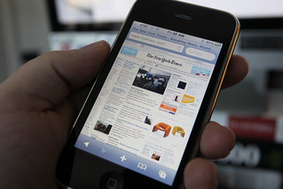 Your website is already mobile. It just might not be delivering the best experience.
Jeff Wisniewski, in his presentation on responsive design at Internet Librarian 2013, said this – “All of your content is now mobile, so be kind.â€
What did Jeff mean? Probably this – If your organization has a website, it’s already “mobile†… because people with smartphones can get to it using their smartphone web browsers.
It’s a done deal.
Well – sorta done. Your website might be available to mobile users, but is it usable? Does it adapt or respond to different screen sizes? Is the content written to be quickly scannable on a mobile device, or is it a huge river of text?
Here’s a question for you: What kind of experience are you providing your mobile customers? Is it good or bad? Have you ever thought about the mobile web user experience? If your organization is providing a less-than-stellar” mobile web experience, what are you planning to do to improve it?
I’d love to know!
Pic by Robert Scoble
Website Redesign going live and going Responsive
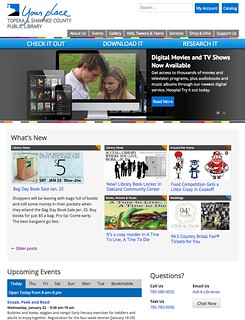 Well, I didn’t really post much about my library’s website redesign. But next week, we go live with it!
You can check it out now at our beta, pre-launch URL – dev.tscpl.org.
Here’s our go-live process:
- Work on the site like crazy (we still have a big list of stuff to do!)
- Today, we posted a head’s up to our customers, and asked them for feedback, too
- We go live on January 29
- Then, we’ll continue to tweak things as we notice them for 2-4 weeks.
- Sometime after the big launch, we plan to have Influx take a peek, to catch stuff we missed.
- Finally, we plan to do some usability testing to catch even MORE stuff we missed.
So, what’s new and different about our redesigned site? Quite a bit:
- We went responsive, so one set of code works on all browsers and devices.
- We have consolidated some of our blogs
- Really worked hard on our links, our navigation, and directing people to the right content
- Modern design, modern web fonts, white space, etc
- On the back-end, we focused on letting WordPress do most of the work, instead of custom-coding. This will make things like sidebar widgets and pages MUCH easier for us to update
And probably much more that I’m missing. So go check it out!
- « Previous Page
- 1
- 2
- 3
- 4
- 5
- 6
- …
- 28
- Next Page »