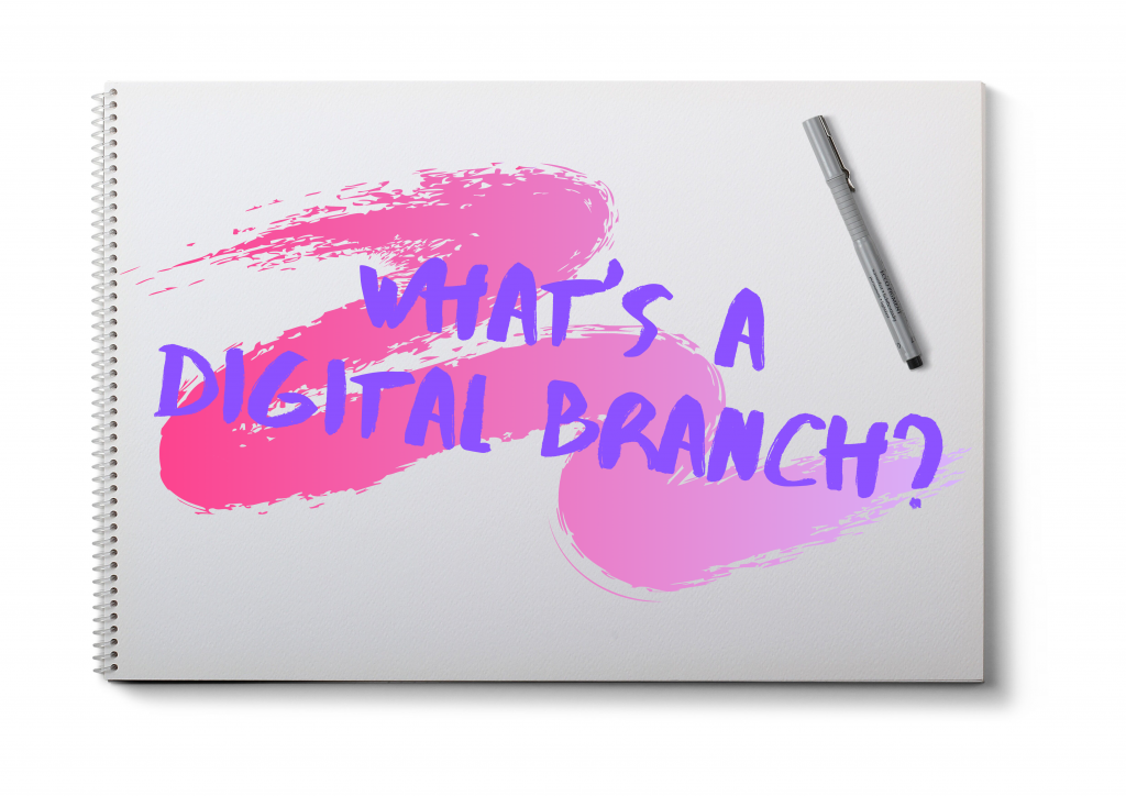
Web Management

Let’s Make Some Mobile, Mmmkay? #Blogworld

by David Lee King on June 6, 2012

BlogworldPresenter: @SaraSantiago co-owner of @RollMobile

Some stats: US smart phone penetration just hit 50% (Neilsen, 2012).

One in four US mobile phone owners use the mobile web every day (Antenna Software Report).

Gartner predicts more people will be accessing the Internet with mobile devices than with their computers by 2012.

If I access your site, what will I see? If it’s not mobile-friendly, people will go find another site that is.

White space time = commute time, getting ready for work, etc. People digest content during that white space time.

Google – howtogomo.com/en/#gomo-meter – looks at your website and tells you how mobile-friendly it is

Responsive design/Adaptive design – discussion about what they both are.

WordPress – install a mobile theme for your blog. Check out http://wordpress.org/extend/plugins/wordpress-mobile-pack/

Other blog software was covered too, including Movable Type, TypePad, WordPress.com, and Blogger.

http://www.lmgtfy.com – Let Me Google That For You

Once you make a mobile-friendly site, test out everything – make sure it works. Click the links, play the video, scroll through the site, click the navigation, etc.

QR Codes: use a link shortener first, then make your QR Code. Makes the code less dense. IF you use a QR Code, the place that code resolves to HAS TO work on a mobile phone. You KNOW the user is on a phone… so make whatever the QR code is pointing to work on a phone.

Sara’s Rules for Providing an Awesome Mobile Experience:

  1. Think. Plan. Resist “shiny new object syndrome”
  2. Remember, you aren’t creating an experience for yourself. So ask your audience what they want.
  3. Please. Don’t make me feel like you hate me. Make it easy and make it work.
  4. HTML5 is not a verb. Do some planning before you do responsive design, use HTML5, etc.
  5. Be the ball. ME – what in the world does this mean? I’m not sure, and all she said was “this is the best advice that I’ve ever heard.”

2 comments

Our Communicating Customers

by David Lee King on May 25, 2012

Big ad on our website for the new library catalogMy library’s in the process of switching ILS systems – we just moved from SirsiDynix Horizon to a Polaris system (to all you non library types out there, I’m talking about our Library Catalog).

We just went live with the new system on May 23, and as you can imagine, it’s taking a couple of days to bring everything up, and get all the parts and pieces working like they should. It’s a huge, complex software/hardware switch, and it’s been a very smooth move, all things considered (mainly because we have awesome, great staff – they rock!).

We have two primary ways that customers can talk to us about the new catalog (well, discounting actually visiting the library and talking to us, and using the phone): an email form and through social media.

We set up an email feedback form that you can see in the catalog, and our customers are using it. So far, we’ve had maybe 20 or so customers communicate their love of the new catalog, their dislike of the “new thing,” or a specific problem with their account. Useful stuff.

Social media has been quite interesting!

First, I wrote a blog post about the catalog, complete with a short video. This post has received about 35 comments so far. Customers asking questions, and me responding to them.

Via Twitter, we have received some nice praise and good comments, including:

  • “Awesome! I’ve been hoping for this a very long time!”
  • “Can’t wait!”
  • “Good luck with the migration1 Bet the new catalog will be awesome!”
  • “We’re excited about the new catalogue! Not surprised that there are some hiccups.”

Facebook has been interesting, because some conversations were started by our customers.

This morning, one of our customers posted this: “Has anyone gotten into the new catalog?” And two people had a conversation about the catalog, about some of the third party things connected to the catalog (like our DVD Dispenser), and what was working/not working.

Since I’m one of the admins of our Facebook Page, I saw those conversations, and was able to answer their questions.

We also instigated some conversations. Yesterday, we posted this: “Today’s upgrade day & most upgrades to the catalog have been made. A few kinks are still being worked out, but you can now explore catalog.tscpl.org – and tell a friend! (Same goes for Facebook. We know you can use your influence to get us a few “likes,” right?;)”

… and that got us 25 Likes :-) . And a couple more questions, too – which I answered via Facebook.

Why mention this? I find it fascinating to see conversations about library catalogs taking place via social media. 10-12 years ago – last time I helped with an ILS switch – I don’t remember seeing much customer feedback (though I’m sure someone got an earful). We didn’t se up email feedback forms, and social media pretty much didn’t exist yet. This time around, customers are helping each other, asking questions and tagging us … and I’m able to see them. And help. And hear.

Amazing.

Be the first to comment

Web Design Trends for 2012

by David Lee King on April 30, 2012

I’ve been working on some large writing projects this year, and in the process, came across some great lists of web design trends for 2012 that I thought I’d share. Let me know if you are incorporating any of these into your websites!

Web design trends for 2012

Web Design Trends in 2012

  • Responsive Web Design
  • Fixed-Position Navigation
  • Circles
  • Big Vector Art
  • Multi-Column Menus
  • jQuery/CSS3/HTML5 Animation
  • Ribbons & Banner Graphics
  • Custom Font Faces
  • Infographics
  • Focus on Simplicity

15 Web Design Trends to Watch Out For in 2012

  • Responsive Interface Design
  • Touchscreen Mobile Devices
  • Tons of Freebies!
  • HTML5 & CSS3 Standards
  • Ribbons and Banners
  • Premium WordPress Themes
  • Online Magazines
  • Easy Drop Shadows
  • Dynamic Typography
  • Image Gallery Slideshows
  • Modal Popup Boxes
  • Inspirational Lists
  • Generated Image Thumbnails
  • Oversized Icons
  • Exaggerated Hyperlinks

Web Design Trends for 2012

  • Oversized Logos/Headers
  • Sketch/Hand-drawn Design
  • Slab Typefaces
  • Typography
  • One Page Layouts
  • Huge Images
  • Change of Perspective
  • Interactive/Intuitive Design
  • Modal Boxes
  • Minimalism
  • Oversized Footer
  • Retro
  • Intro Boxes
  • Magazine Layouts

Top Website Design Trends for 2012

  • HTML5, CSS3 and JQUERY
  • Mobile Compatibility and Responsive Layouts
  • Typographic Layouts
  • The Grid
  • Large Background Images
  • Perceived Affordance and Metaphoric Design
  • Social Media Integration
  • Illustration
  • Single Page Websites
  • Parallax
  • Elegant Modal Boxes

15 Top Web Design and Development Trends for 2012

  • Progressive enhancement
  • Responsive design
  • Flash will survive
  • Native support for plug-in features
  • Appification takes hold
  • Web app fragmentation
  • Mobile gets bigger
  • A device explosion
  • Respect beyond aesthetics
  • social battles heat up
  • Growth of the two-screen model
  • Distributed workforces
  • Stronger customer service
  • Better value, not lower prices
  • Pushing the boundaries

The State of Web Design Trends: 2012 Annual Edition

  • Responsive Web Design
  • Grid Systems
  • Typography
  • Technology Pushing Art
  • Scrolling, Vertical Narratives
  • Like it’s 1983
  • Modular Interfaces

So – get busy and start designing like it’s 2012!

image by Mike Licht

3 comments

Gina Millsap and I gave this presentation last week at the Texas Library Association’s annual conference (this year in Houston, TX). Great conference, fun people!

Especially check out the final part of this presentation – it will give you a little insight into how my library decides on strategy – through data-mapping and GIS market segmentation data. Really handy stuff.

Enjoy!

asdf

1 comment

Smartphones, Libraries, and your website

by David Lee King on April 5, 2012

I was just looking at March 2012 statistics on my library’s website. Here’s what I saw:

  • 39,161 visits to our website in March
  • 3486 visits via a mobile device.
  • that means slightly more than 11% visited via a mobile device
  • Those devices? Mainly iPads, iPhones and iPod Touches – 57.89%
  • That fits with the web browsers that visited our site – 14.11% were Safari (think ithingies here)

Now look at Pew’s newest Smartphone Update, released on March 1: 46% of American adults are smartphone owners as of Feb 2012. There was an increase of 11% in just 9 months.

And check this out – it’s not just wealthy people getting smartphones:

“Nearly every major demographic group—men and women, younger and middle-aged adults, urban and rural residents, the wealthy and the less well-off—experienced a notable uptick in smartphone penetration over the last year. Overall adoption levels are at 60% or more within several cohorts, such as college graduates, 18-35 year olds and those with an annual household income of $75,000 or more.”

So my question to you: are you designing for mobile? A mobile app, or a mobile website?

If you haven’t yet started building with mobile in mind, now is definitely the time to start – you are very close to alienating almost half your customers. They are interacting with their favorite sites online using their smartphone (think Facebook, Amazon, Youtube, etc.).

Wanna be one of those favorite sites too? Then you had better get that mobile site up and running FAST.

smartphone photo by Bigstock

3 comments