 Remember my post about Managing Multiple Instagram Accounts? Well, Instagram has just made this simple (at least, the logging in part).
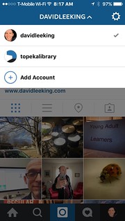
Take a peek at the image in this post (a larger version is on Flickr). Instagram just added a multiple account login feature to their mobile apps.
Here’s how you set it up:
- In your app, click the Accounts icon (on the right side of the menu bar at the bottom of the screen).
- Then you have two choices:
- Click the Settings icon (the “gear” icon). Scroll down to the bottom of the screen, and click Add Account. Then add your second account!
- Or click your name up at the top of the screen. A menu drops down that includes Add Account as a choice. Then add that second account.
Once you’ve added a second account, you can toggle back and forth between accounts instead of having to completely log out, then log bak in each time you want to switch accounts.
It’s magic! Ok – not really. It’s a simple user experience improvement that many people have requested. Yay to Instagram for listening!
Interested in the Instagram accounts I play with? Find my Instagram account here, and my library’s Instagram account here. Enjoy!
 Make your website
  I recently read
  Do you adequately staff the busiest parts of your library? For example, if you have a busy reference desk, you probably make sure there are staff to meet demand.