 Just a follow-up to my last post. There are a lot of books out there that have some great tips on improving your presentations. Here are some good places to start:
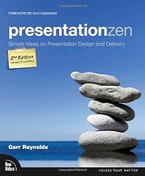
- Presentation Zen: Simple Ideas on Presentation Design and Delivery
- Why Most PowerPoint Presentations Suck: and How you can make them Better
- Resonate: Present Visual Stories that Transform Audiences
- slide:ology: The Art and Science of Creating Great Presentations
And some awesome online resources:
- Presentation Zen – the blog
- 5 Rules for More Effective Presentations by Michael Hyatt
- An Introvert’s Guide to Better Presentations by Matt Haughey
- 10 Simple Tips for Creating Better-looking Presentations by Wouter Walmink
- 10 tips on how to make slides that communicate your idea, from TED’s in-house expert by Aaron Weyenberg
What books, blogs, or other stuff would you add? Please add em in the comments!
 I’ve been doing a lot of reading on responsive design lately (because my library is headed towards that), and that made me think. When designing websites, we tend to design for devices. That’s what responsive design is all about – it’s coding in such a way that your website “responds” appropriately to different screen sizes (i.e., desktops, tablets, smartphones). We design for things: for a desktop; for a screen; for a browser; for a tablet or smartphone.
 I just read