
I just had an article published in Computers in Libraries (Jan/Feb 21 issue), all about how my library has adjusted during this crazy time.
Here’s how the article begins:
2020 will no doubt go down in history as a terrible, horrible, no good, very bad year. What other year has had—let’s see—a global pandemic, an election with less-than-stellar choices, an impeachment hearing, riots, British royalty giving up on being royals, fires, hurricanes, derechos, and murder hornets? I’ll bet I’m even missing a few major things.
For libraries, it was a year of upheavals. Many were forced to quickly rework their services and redefine their offerings in order to meet new needs arising out of the pandemic response, as well as keep the library running from a distance. However, on the upside, I think some of the changes libraries have been forced to make during the pandemic will turn out to be good for them.
Here are 10 positive lessons we’ve learned (so far) at Topeka and Shawnee County Public Library in Kansas, which will no doubt influence our strategic planning for years to come.
… and here’s a link to the full article at Information Today. Enjoy!
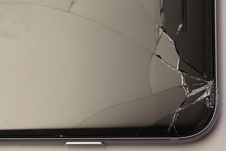 A few weeks ago, I dropped my iPhone and cracked the screen (see accompanying picture of my poor iPhone).
 When I was about 5 feet from the store entrance, I received a notification (see the image) welcoming me to the store, reminding me about my Genius Bar reservation, and telling me what to do next (check in).
 [This is an article I wrote for my book,