Yesterday, I gave a 3-hour seminar on change, the emerging web, and customer experience to a group of librarians at SEKLS. It was a good day! There was some great discussion, and people told me they learned something, too – can’t beat that!
Here are the slides from that session. Thanks, SEKLS!

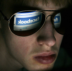 A day or two ago, we invited a couple of our patrons in for a focus group session on our website. The goal was to gather insights about our current website that can be incorporated into our redesign … but in the process, one patron in particular shared some eye-opening insights into how she uses Facebook.