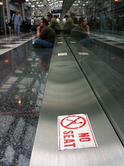
 Take a look at this pic – it’s at the Chicago O’Hare International Airport Denver airport. I really don’t know the why’s behind this sticker, but I can guess. And I’d guess it goes something like this:
When the moving walkway was installed, they made these little metal ledges. Maybe the ledge houses a belt, or gears – maybe it’s just for looks. Who knows?
Either way, as the airport got busier, and delays started happening more often, customers looked around for a seat and couldn’t find one. Then they eyed that handy, seat-sized ledge – and sat.
When airport staff noticed that lots of people needed seats, and were using those handy little seat-sized ledges, what did they do? Did they install more seats? An overflow room? Restaurants with more seating? Nope. They chose to put a big fat sticker on the seat-sized ledge that reads “no seat.”
So – a question. Who do you think airport administrators were thinking of when they created that sticker and stuck it to the makeshift overflow seating area? Were they thinking of their customers, who didn’t have a place to sit? Or were they thinking of their staff? I’d guess the airport’s decision had more to do with themselves than with their paying customers with tired legs.
Moral of the story? Always put your customers first. In the airport’s case – instead of a “no seat” sticker, how about putting out cushions? Work hard to always improve your customers’ experience while using your services, even with the seemingly innocuous things (like little seat-sized metal ledges).
Your customers will remember it and you will be a hero.
Update – Chuck Cannon, Director of Public Affairs at Denver International Airport pointed out that I had the wrong airport. Sorry! Just updated the post.
 Some web designers, especially those with a marketing or graphic design background, say they want to build an experience – but their designed experience, no matter who the website is for, tends to be designed like a movie or a rockstar’s website – heavy on the Flash, on the intro page (complete with low-pitched ominous music), and it makes cute noises when you click on a link.
 I had a conversation with my supervisor (