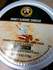
 I love how some companies do that “informal language” thing – like Einstein Bros Bagels. Have you seen what they call their cream cheese? They call it “shmear.” Because you “shmear” it onto your bagel, right?
When businesses do that type of thing – use informal slang, or informal visuals in signage, or even when they always do certain things the same way – they are expressing their organizational personality.
What do I mean by organizational personality? Well – have you ever walked into a store, a business, even a restaurant … and felt the “vibe” of the place? Suddenly felt like you needed to whisper, for example? Or the atmosphere of the place felt light and lively, and immediately put a smile on your face?
Those businesses are most likely aware of that vibe … and have even planned for it. When they focus on creating certain types of consistent experiences, and on consistent touch points, they are expressing their organizational personality.
And once that personality is created, an organization can consistently express it everywhere – in a storefront, online, out of the office, even in print material.
Does your organization have a personality? You bet. Do you know what it is, and how to express it in different venues? Probably not, I’m guessing. Libraries are a great example of this. For many of us, the in-the-library personality is expressed as a fun, casual, maybe even sometimes inspirational one – smiles, helpful staff, colorful books, etc. That adds up to a light, informal, casual-but-hip organizational personality.
But when you visit the library’s website, you get a different personality entirely. Frequently, the website isn’t fun at all – instead, it’s all columns, formality, staid colors, and no friendly chatter at all. Very different personality from the in-the-library experience, isn’t it?
Give it some thought – figur out what your organization’s personality is, and how it’s being expressed. Then work on making that organizational personality consistent everywhere. It’ll add up to a better, more consistent experience for your customers.
 First, a funny story. When I lived in Nashville, I frequented a cool used record store. During one trip, I was trying to decide whether or not to buy a couple of old jazz cassette tapes (hey – I was on a tight budget).
 I’m pretty psyched to be speaking at a number of cool places this year (if you’re really curious about my 2010 schedule, look at