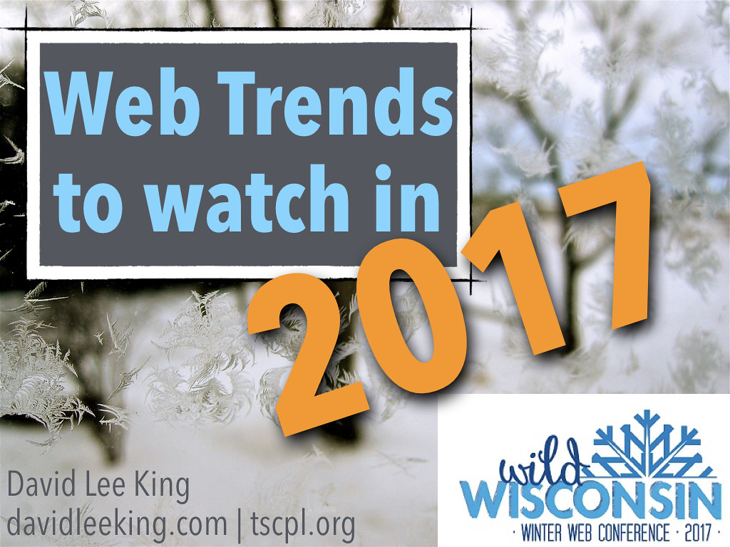
http://www.davidleeking.com/wp-content/themes/thesis_16

Posts tagged as:

Web Design

Showing Patrons the Door

by David Lee King on February 3, 2010

First, a funny story. When I lived in Nashville, I frequented a cool used record store. During one trip, I was trying to decide whether or not to buy a couple of old jazz cassette tapes (hey – I was on a tight budget).

The tiny shelf these cassette tapes were on was packed WAY too tightly, so when I tried to pull one cassette out to examine it, 2-3 others would fall out at the same time. And make lots of noise as they hit the floor (it was tile, of course). This happened a couple of times … in a row … and was pretty embarrassing!

So – to ease my embarrassment at not being able to figure out how to successfully pull a cassette tape off the shelf, a “helpful” shop security guard came over to me. He stood behind me, stared at me for a second, and said (and I quote) – “you’ve got 10 minutes, then you’d better be out of my store.” Then he walked away.

Boy, that helped. Thanks :-) That day, the store essentially “showed me the door” in no uncertain terms. Even though the problem wasn’t me – it was their tightly-packed shelf.

Now on to the title of this post, and to my point. Showing patrons the door? Yikes – we’d never do that (under normal circumstances, anyway)! Unlike the silly used record shop, librarians would never consciously walk up to a patron and tell them to leave if that patron was having trouble using something in the library … right?

I think we DO sometimes tell our patrons to leave when we make things difficult for them. We might as well be saying “here’s the door, don’t let it hit you on the way out.”

For example, if your library has a blog, do you moderate those comments? Quickly? I know of libraries that can go 1-2 weeks before they get around to moderating comments. In and of itself, moderating a comment is fine, as long as they are moderated fast (like within 1-4 hours). Blog posts are supposed to be the start of a conversation; comments continue that conversation. If those comments aren’t approved at least in the same day, you have essentially killed that conversation. To me, that sounds like showing patrons the door.

Is your website confusing? Do customers have to puzzle out what they need to do next while on your site? If so … your website is showing patrons the door. Same with our catalogs – a confusing catalog might just steer customers away from checking stuff out – and that’s one of our major, must-have services!

Do you let patrons sign up for a library card online (some libraries don’t)? How about having an online sign-up form that asks for WAY too much info? That’s a sure-fire way to show patrons the door.

What labels and naming schemes do you use on your site? Using heavy-duty librarian jargon might just be a great way to usher patrons towards the door.

How about not having a Facebook Page (or even blocking Facebook altogether)? Or simply doubting that your patrons use Facebook (without actually signing up for a Facebook account and checking)? Yet another way to show a group of very active, involved patrons the door.

Other ways to show patrons the door might include hard to find stuff on your website, hidden content, or even library services that aren’t mentioned anywhere on your website.

So – what do you think? What else shows patrons the door, and how can we fix that?

Pic by Cayusa

{ 11 comments }

Time to Update?

by David Lee King on December 8, 2009

Ever seen a library website that had many of the “normal things” in place, like the library catalog, a handy database link, and an easy way to ask questions … but the people in charge of the site had obviously forgotten to update some of the “little details?”

Here’s what I mean – take a peek at these two screenshots. Here’s the first one:

don't do this!

The “site best viewed with…” statement has a problem or two. First of all, it’s simply not true – I was viewing it FINE using Firefox on a much larger resolution.

Secondly (if the statement’s true), it makes “visiting the library” much harder for a pretty significant chunk of people. For example, at my library’s website, 68% of our web visitors use some form of IE – but that’s most likely weighted, since our 177 public PCs have IE installed, and everyone hits our website upon opening the browser. On my blog, only about 30% of you are using IE… again most likely skewed a bit, since y’all are amazing people who know your stuff (and like to use Chrome, Safari, Firefox, etc, etc, etc).

My point? If you design for one browser, you are in essence making the digital library visit harder for 30-50% of your customers. Would you do that with your physical library? Like make all the doorways 5ft 8 in high, so anyone taller than that would either have to stoop to go through (or would bump their heads) … and then put up signs that say “Library Best Entered by people under 5′ 8″ tall?” I’m guessing not.

[And one other tiny little thing here - if you don't want people to email reference questions to the web email address... don't put the address on the page. Just funnel everything through the large "Contact Us" link, and call it good.]

And one more very similar problem (sorry for the tiny text! Click the pic to see a larger version):

don't do this!

Same stuff, but worse:

  • There is no Netscape Communicator anymore
  • Copyright 2002-2007? What happened to 2008 and 2009?
  • 4.x browsers and above?

I’m guessing the main problem is that the footer has been ignored for at least 3 years, probably longer.

Why bring this up? It’s probably a good idea to check on those little hidden details of your website every so often. Do they still make sense? Does it still hold true? Is it even necessary? Think about it … and edit as needed.

{ 5 comments }

Conversation is Experience

by David Lee King on October 8, 2009

Some web designers, especially those with a marketing or graphic design background, say they want to build an experience – but their designed experience, no matter who the website is for, tends to be designed like a movie or a rockstar’s website  – heavy on the Flash, on the intro page (complete with low-pitched ominous music), and it makes cute noises when you click on a link.

That’s great for a movie or a rockstar website. But most of us are building library, organization and company websites. What type of “experiences” should we be creating for those types of websites?

Conversation Spaces

Visitors to your website want to talk – with you, and with each other. Are you providing conversation spaces? The web is FULL of conversation now – check out Amazon, most newspaper and TV news sites, YouTube, this blog, Facebook, Twitter – all spaces where conversation can happen. And conversation DOES happen, because that’s what people do. We like to talk, we like to share, we like to voice our opinion (as I hope some of you do in the comments!).


So, my simple digital experience tip for today is this – make sure to create conversation spaces on your websites. Places like comment boxes, online forums or discussion groups around a topic, Twitter accounts for feedback, online places to Ask a Librarian, etc.

Enable Conversations

Also remember to actually enable conversations once you build the space. What’s that mean? In my library’s case, we allow unmoderated comments to fly free and easy onto our digital branch. I know what some of you are thinking – “OMG, David! Don’t you have a TON of cussing, swearing, name-calling, and other highly inappropriate things being posted? How could you EVER allow that!???!!??”

Um. No. We simply don’t have that. Yes, once in awhile we have some negative comments. But why would we moderate or not show those? Instead, we respond appropriately.

But some of you will need to moderate comments for one reason or the other (i.e., those old-fashioned city attorneys who haven’t yet discovered the joys of Facebook). If you DO moderate comments, make sure to do it quickly. Same day is good. Same hour is best. Why? Because it’s a CONVERSATION. If someone starts a conversation and you don’t get around to moderating the comment for a few days … well, you have killed the conversation. And that’s really no conversation at all.

pic by Adventures in Librarianship

{ 2 comments }

Idea from Designing for the Social Web

by David Lee King on August 5, 2009

Just read/skimmed Joshua Porter’s book, Designing for the Social Web (Voices That Matter). In all, it’s a good book that has lots of great ideas for building social sites. The book focuses first on defining what the social web is, and then spends the rest of the book discussing design and interface problems for the social web, and how to fix those things.

One idea I wanted to share (and to remember for my own future use) is this, from page 34:

“So how do you avoid feature creep when creating and adding features? Start with your objects, your nouns. Observe all the actions people do with/perform on those objects, and those are possible features for your application.”

So, for example, a list of nouns or objects might be Videos, Articles, Photos, and Books. The Verbs, or actions, for Articles include things like this: read, archive for later, quote, link to, share, comment on, annotate, etc.

Cool idea! So – when building a new website or web app, this is a great way to figure out what it should do, and what features it should have (and what features people will potentially ask for, too).

pic by Ben Dodson

{ 2 comments }

Speaker: Paul Annett, Clearleft

Started off talking abut the arrow within the “Ex” of the FedEx logo and other hidden things within logos, fences, etc.

Innocent Smoothies (a juice company in England) – there’s a different message on the bottoms of some of their cartons. One says “stop looking at my bottom.”

Can do this in web design too – type about:mozilla into your firefox browser, into each version, and you get an unfolding story from a fake book about Mozilla…

… giving a live example … with audience participation, props, and a guy dressed in a gorilla suit

Showing fun ways to use css and backgrounds – when you resize the screen (twequency as example) clouds go by. Nice

Ho ho ho hat in flickr – users loved it!

Google Moon – if you zoomed in all the way, you saw cartoon cheese

They have planted “easter eggs” in websites – you have to find them, they’re sorta pointless (other than making people smile)

Transparency in web design – making things that aren’t white, but are transparent. Can be cleverly used

David Emery – his website does interesting things..

Kano Model of customer satisfaction: lots of this type of “customer delight” stuff fits in his model

Basic needs – with a hotel room, you’ll be mad if there’s no toilet paper, but lots of rolls don’t delight you. On the web, having a page that just works is a basic need

Creatives and designers work on fulfilling excitement needs

{ 0 comments }