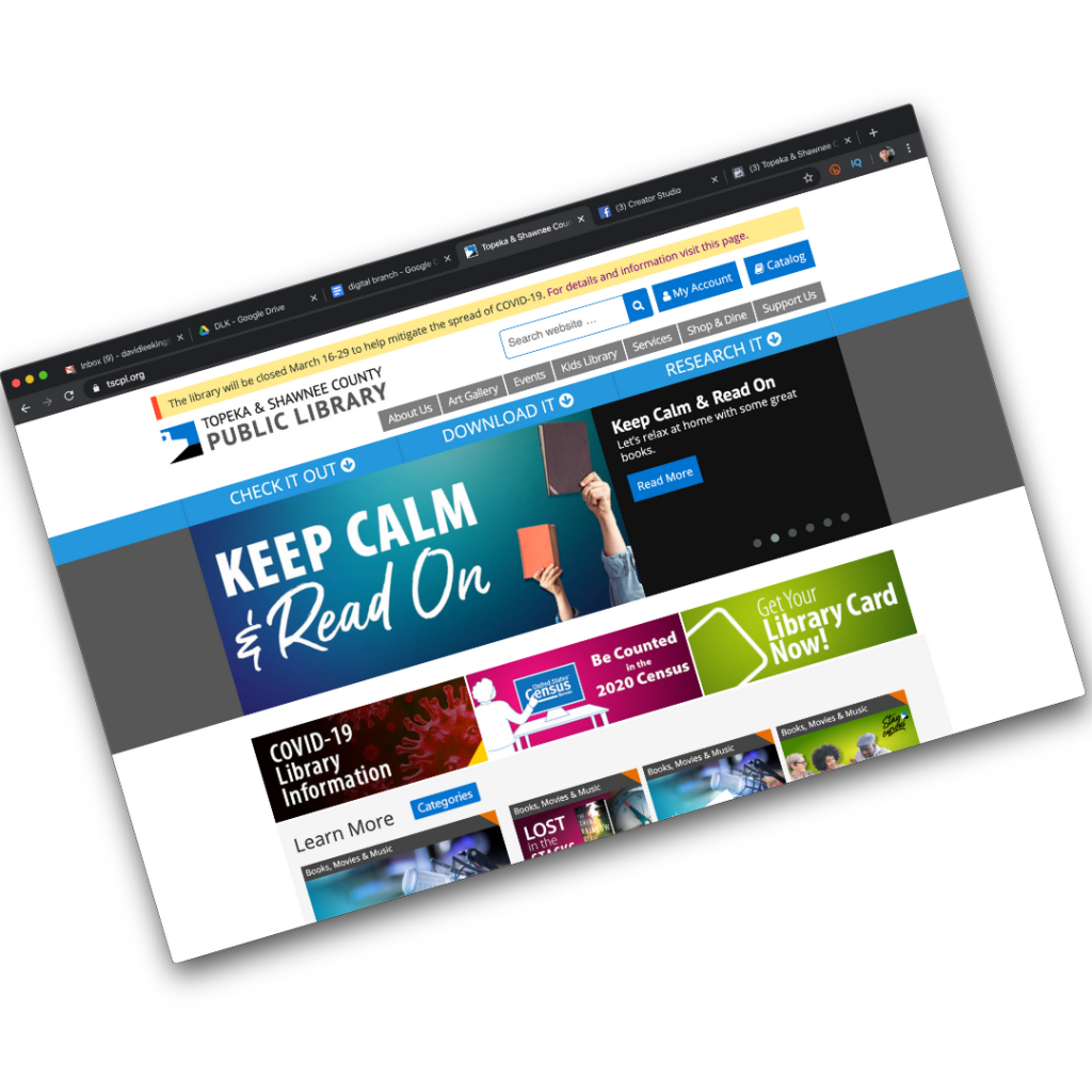
My library is working on a new, redesigned website. We’re really excited about it! We’ll probably go live sometime this summer/early fall (fingers crossed).
This time around, we have been working with a local web design agency, Imagemakers, to redesign and re-imagine our website. They really stretched us during the early stages of this project, and I thought I’d share one of the ways they did that.
Early on in the process, they asked us “What does your community want to do?”
Did you see that? They didn’t ask “What do your customers want to do?” or “What do book lovers want to do?” They helped us focus on our greater community, and what the community wants to do.
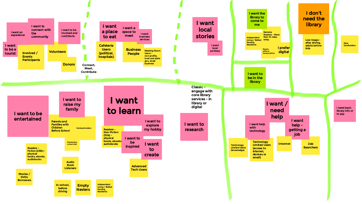
This was a really fun exercise (and yes, we used Jamboards for this brainstorming session)! And it helped us define and group together the things that: 1. Our community wants to do; and 2. What the library can do to help the community … do that stuff.
See the image in this blog post for a snapshot of that exercise. Here are some of the things we determined that people living in Topeka and Shawnee County, KS want to do:
- I want to be entertained
- I want to raise my family
- I want to learn
- I want to create
- I want a place to eat
- I want a space to meet
- I want to be involved and contribute
- I want help getting a job
- I want to be in the library
- I want the library to come to me
- Etc.
After we did this for awhile, we started brainstorming how the library can help meet those wants and needs (notice we’re still not actually talking about the website, but about the library).
With each of those “I want to“ statements, the library, for the most part, is already doing something that helps meet those needs and wants … with a service, a resource, or a part of the library.
For example:
- I want to eat. We have a cafe in the library, and we do an afternoon meal for kids who need it. And we have cookbooks and cake pans.
- I want to be entertained. That one’s easy – that’s a big part of what we do as a public library! But it’s also a different way to think about our traditional collections and events.
- I want to create. We have a digital media lab (still closed because of the pandemic), and are planning to expand those services. We also have many books focused on making all sorts of stuff, and we occasionally teach classes on how to create a variety of things, as well.
- I want a space to meet. We have a variety of meeting rooms that customers can use. Plus the cafe, if you want to grab coffee for the meeting.
- I want the library to come to me. We just started our TSCPL@Home service, which is a home delivery service for anyone in the community. We also have a bunch of ebooks, databases, streaming video, and online classes that meet that need.
- Etc.
So how does the website play into this? Well … the library’s website simply reflects what the actual library does. Not just the physical building, but the overall library. The stuff we have, the experience you have when interacting with our stuff and staff, our outreach services, and yes – our digital branch resources as well.
Starting a website redesign by brainstorming how to meet our community’s needs, and then superimposing those ideas back to the library (and eventually back to the website) is a great way to redefine what you want in a website … and in the library, for that matter.
Those types of backwards questions and prompts can be a big help in kickstarting more creative thinking about your library, your website … and pretty much any project you start.
Give it a try!
 Do you adequately staff the busiest parts of your library? For example, if you have a busy reference desk, you probably make sure there are staff to meet demand.