Here’s my newest article over at Emerald Group Publishing.
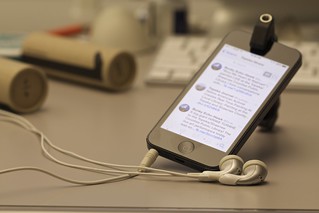
This month, I focused on an easy way to make sure your website works for your mobile customers.
Actually using your website, as a customer, via your smartphone.
Pretty simple idea, yet one that we often overlook. Use your website like your mobile customers would. Not for a minute or two – actually do it for a good chunk of time, like a week.
See if it works. See if the experience is where you want it to be. See if you can do everything that you can do using the desktop version of your website.
And if you discover that the mobile version of your website isn’t where you want it to be? Well … there’s your next web project!
Go read my article, and let me know what you think!
Pic by me, over at Instagram.
 I’m still at
  I just read